


LOGO & PACKAGING DESIGN
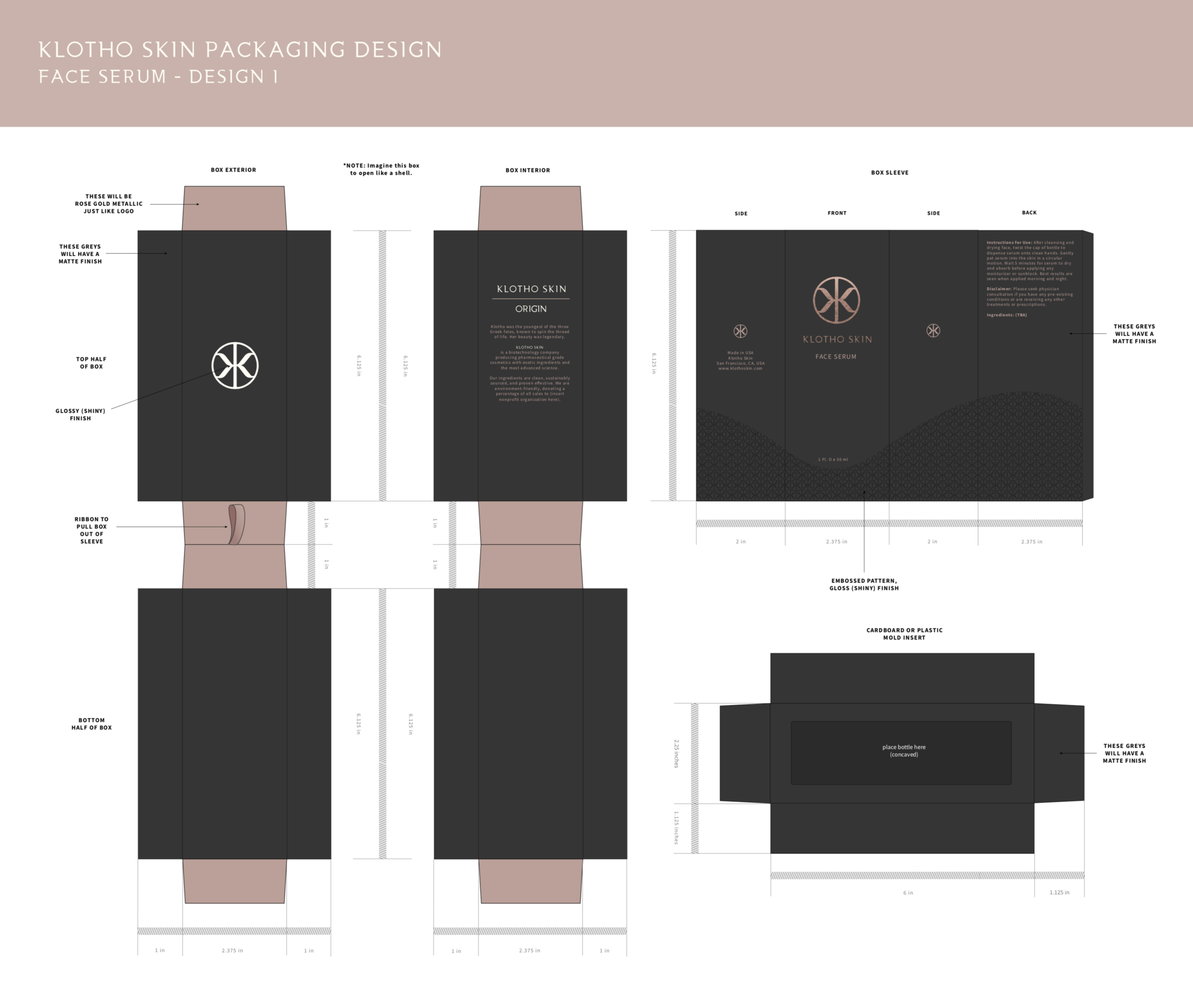
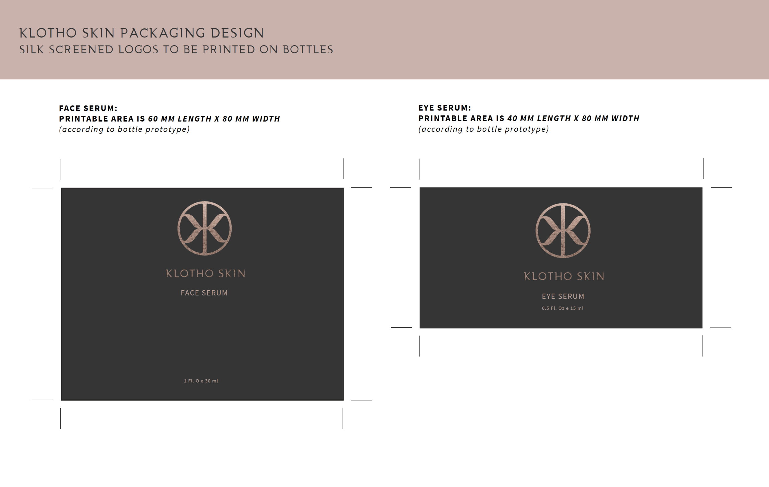
KLOTHO SKIN is a biotechnology company producing pharmaceutical grade cosmetics with exotic ingredients and the most advanced science. I had the honor of creating their logo and packaging. The client envisioned a sleek, cutting edge, minimalist design for both. I created two concepts for the packaging design and we ultimately went with DESIGN 1.
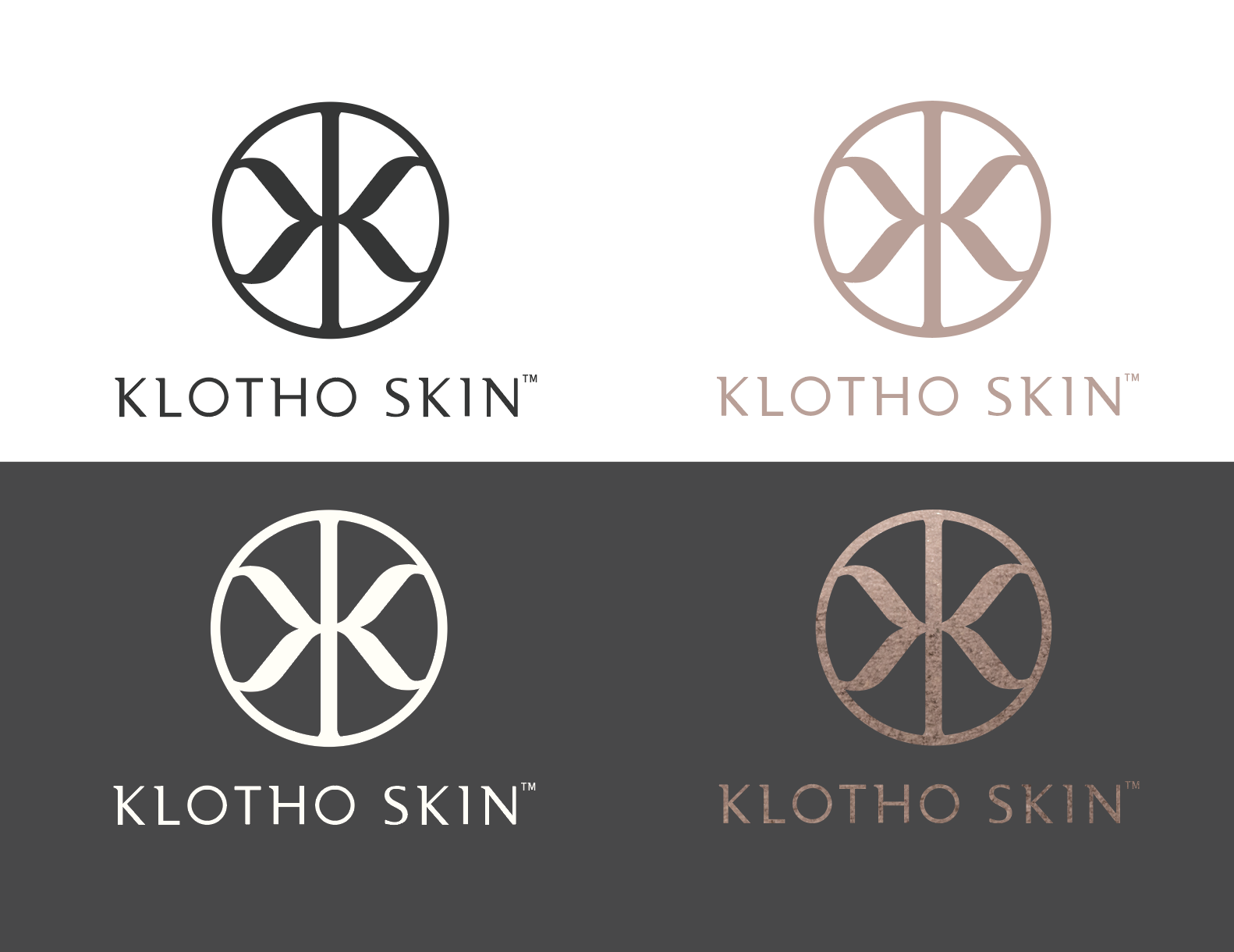
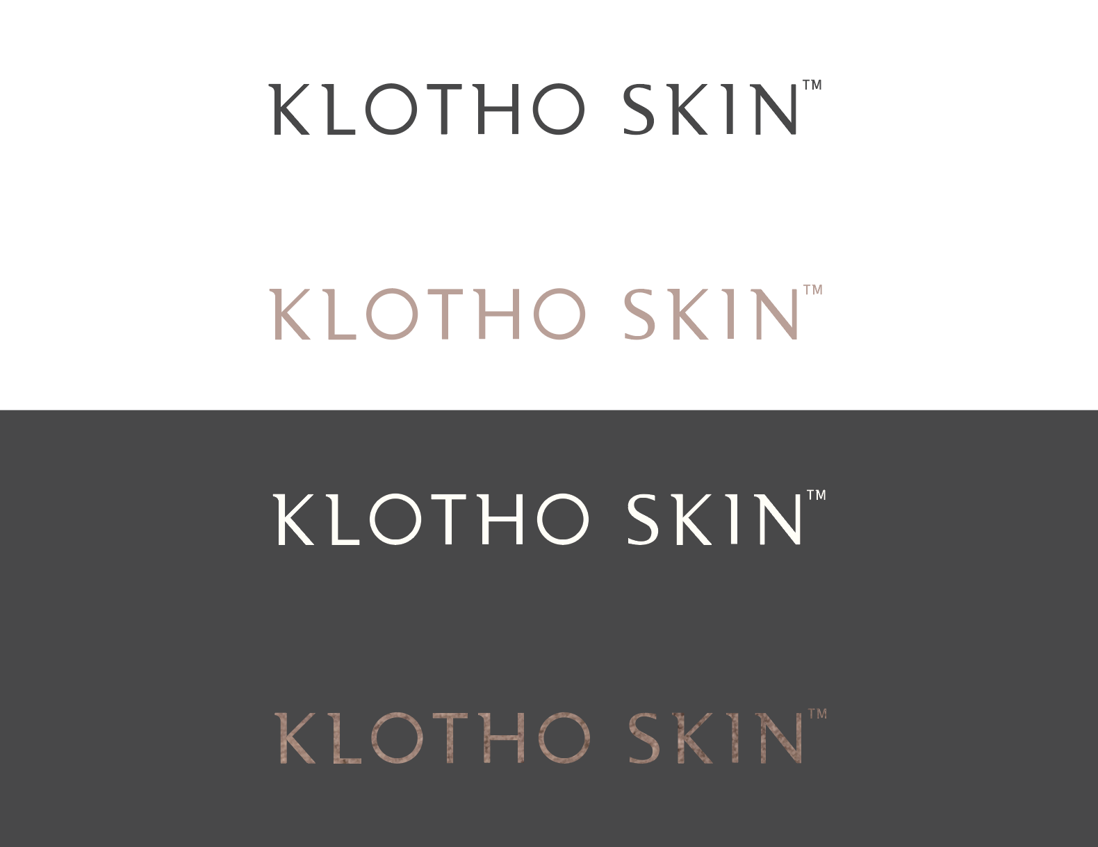
About logo design:
KLOTHO SKIN is based on the origin of the Greek Goddess, Clotho (original spelling), one of the Three Fates who spin, draw out, and cut the thread of life in ancient Greek mythology. Clotho was responsible for spinning the thread of human life.
TECHNICAL DESCRIPTION:
• Decreased circle weight
• One repeated Serif component, taken from the letter “K” of Klotho Skin, reflected on left and right
• Repeated Serif components attached to stem
SYMBOLISM:
• Circle symbolizes youth, beauty, and eternity
• Stem in the center of the logo symbolizes a spindle as the Goddess was responsible for spinning the “Thread of Life”
• “K” Serif components symbolizes the “Thread of Life” itself as it’s about to be spun
OTHER CHARACTERISTICS OF EMBLEM:
• Luxury
• Modern
• Sleek
• Cutting-edge
See initial packaging designs in closer detail HERE.
See final packaging designs HERE.
Tasks: Logo design, branding, identity, package design